Data distributions and transformations
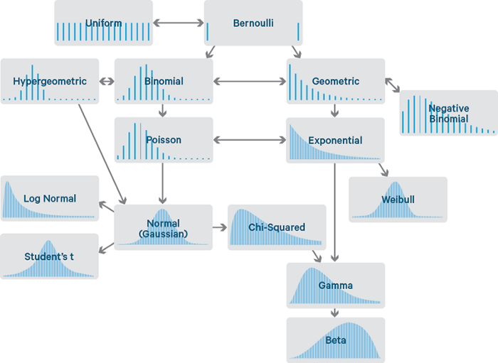
- Why scale your data?
- Many machine learning algorithms perform better or converge faster when features are on a relatively similar scale and/or close to normally distributed. Scaling and standardizing can help features arrive in more digestible form for an algorithm.
Visualizing and describing
Get a snapshot of the composition of the data
from sklearn import datasets
import pandas as pd
import numpy as np

boston = datasets.load_boston()
X, y = boston.data, boston.target
df = pd.DataFrame(data=boston.data, columns=boston.feature_names)

df.info()
# display first 5 rows of df
df.head()
Pandas describe function to produce some quick descriptive statistics.
# percentile list
perc =[0.05, 0.10, 0.25, 0.50, 0.75, 0.90, 0.95]

df.describe(percentiles = perc, include = [np.number, np.object])
Skew: The degree of distortion from a normal distribution.

- For example if the response variable is skewed in a house pricing regression, the model will be trained on a much larger number of moderately priced homes, and will be less likely to successfully predict the price for the most expensive houses.
The concept is the same as training a model on imbalanced categorical classes. If the values of a certain independent variable (feature) are skewed, depending on the model, skewness may violate model assumptions (e.g. logistic regression) or may impair the interpretation of feature importance.
# find skew using pandas
df.skew().sort_values(ascending=False)
Shapiro-Wilks test:
- We can objectively determine if a variable is skewed using the Shapiro-Wilks test. The Shapiro–Wilk test tests the null hypothesis that a sample x1, ..., xn came from a normally distributed population. The null hypothesis for this test is that the data is a sample from a normal distribution, so a
p-valueless than0.05indicates significant skewness.
Rank 1D from Yellowbrick
- A one-dimensional ranking of features utilizes a ranking algorithm that takes into account only a single feature at a time (e.g. histogram analysis). By default we utilize the Shapiro-Wilk algorithm to assess the normality of the distribution of instances with respect to the feature. A barplot is then drawn showing the relative ranks of each feature.
from yellowbrick.features import Rank1D
import matplotlib.pyplot as plt
import seaborn as sns
sns.set(style="darkgrid", color_codes=True)

rnk1 = Rank1D(algorithm='shapiro')
rnk1.fit(X, y)           # Fit the data to the visualizer
rnk1.transform(X)
plt.close()

rnk1_df = pd.DataFrame(rnk1.ranks_, index=df.columns, columns=['Rank'])
rnk1_df = rnk1_df.sort_values('Rank', ascending=False)

f, axes = plt.subplots(1,2 ,figsize=(12,5))
sns.barplot(x='Rank', y=rnk1_df.index, data=rnk1_df, ax=axes[0])
axes[0].set_title('Features')
axes[0].set_xlabel('Sharpio Rank')
axes[0].grid(False)

sns.barplot(x=df.skew().abs().sort_values(), y=df.skew().abs().sort_values().index, ax=axes[1])
axes[1].set_title('Features')
axes[1].set_xlabel('Absolute Skew')
axes[1].grid(False)

plt.tight_layout()
plt.show();
Function to produce more descriptive statistics.
from scipy import stats

def resumetable(df):
    print(f"Dataset Shape: {df.shape}")
    summary = pd.DataFrame(df.dtypes,columns=['dtypes'])
    summary = summary.reset_index()
    summary['Name'] = summary['index']
    summary = summary[['Name','dtypes']]
    summary['Missing'] = df.isnull().sum().values
    summary['Uniques'] = df.nunique().values
    summary['First Value'] = df.loc[0].values
    summary['Second Value'] = df.loc[1].values
    summary['Third Value'] = df.loc[2].values

    for name in summary['Name'].value_counts().index:
        summary.loc[summary['Name'] == name, 'Entropy'] = round(stats.entropy(df[name].value_counts(normalize=True), base=2),2)

    return summary
resumetable(df)
View individual feature distributions
df.hist(figsize=(11,11), grid=False);
Empirical Cumulative Distribution
# visualising ECDF
from mlxtend.plotting import ecdf

fig, axs = plt.subplots(ncols=2, nrows=0, figsize=(13, 40))
plt.subplots_adjust(right=2)
plt.subplots_adjust(top=2)

for i, feature in enumerate(list(df), 1):

    plt.subplot(len(list(df.columns)), 3, i)
    ecdf(df[feature])
    plt.title(f'{feature}', size=15, fontsize=12, fontweight='medium')
    plt.grid(False)

    for j in range(2):
        plt.tick_params(axis='x', labelsize=8)
        plt.tick_params(axis='y', labelsize=8)

plt.tight_layout()
plt.show()
# visualising scaled ECDF and KDE
from sklearn.preprocessing import StandardScaler

num_lines = len(df.columns)
colors = [plt.cm.jet(i) for i in np.linspace(0, 1, num_lines)]

from pylab import rcParams
from cycler import cycler
rcParams['axes.prop_cycle'] = cycler('color', colors)
rcParams['axes.grid'] = False

z0 = df.values
z1 = StandardScaler().fit_transform(z0)
df_scld = pd.DataFrame(z1, columns=df.columns)

f, axes = plt.subplots(1,2 ,figsize=(16,5))

for i in df_scld.columns:
    ecdf(df_scld[i], ax=axes[0], ecdf_marker='.')
    sns.kdeplot(df_scld[i], ax=axes[1])

axes[0].set_title('Standardized Features ECDF')
axes[1].set_title('Standardized Features KDE')
axes[0].legend(list(df_scld.columns))
axes[1].legend(list(df_scld.columns))
plt.show()
View feature boxplot
f, ax = plt.subplots(figsize=(8, 5))
ax.set_xscale("log")
sns.boxplot(data=df , orient="h", palette='Set1', ax=ax)
plt.xlabel('Log')
plt.show();
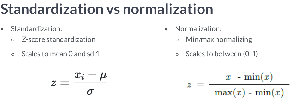
Standardization, or mean removal and variance scaling:
- Standardization of datasets is a common requirement for many machine learning estimators. Models might behave badly if the individual features do not more or less look like standard normally distributed data:
Gaussian with zero mean and standard deviation of 1.
from sklearn import preprocessing

X_train = np.array([[ 1., -1.,  2.],
                     [ 2.,  0.,  0.],
                    [ 0.,  1., -1.]])

scaler = preprocessing.StandardScaler().fit(X_train)
print(scaler.transform(X_train))
Scaling features to a range:
- An alternative standardization is scaling features to lie between a given
minimum and maximum value, often between zero and one, or so that the maximum absolute value of each feature is scaled to unit size. This can be achieved usingMinMaxScalerorMaxAbsScaler, respectively.
Transform features by scaling each feature to a given range.
from sklearn.preprocessing import MinMaxScaler

data = [[-1, 2],
        [-0.5, 6],
        [0, 10],
        [1, 18]]

scaler = MinMaxScaler()
scaler.fit(data)
print(scaler.transform(data))
Scale each feature by its maximum absolute value
from sklearn.preprocessing import MaxAbsScaler

X = [[ 1., -1.,  2.],
     [ 2.,  0.,  0.],
     [ 0.,  1., -1.]]

transformer = MaxAbsScaler().fit(X)
print(transformer.transform(X))
Scaling data with outliers
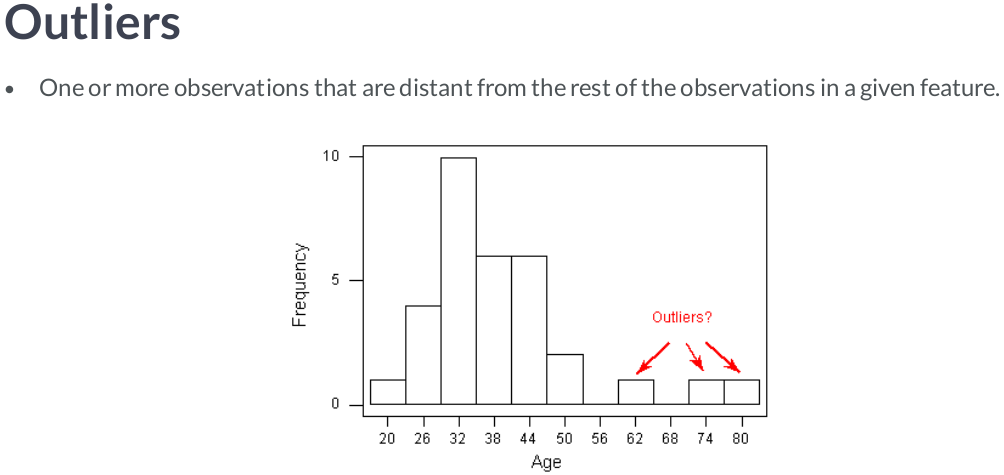
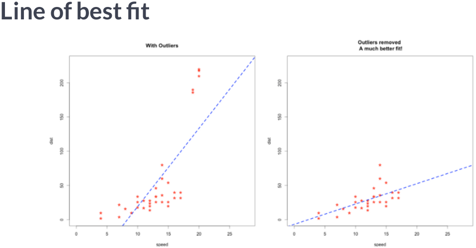
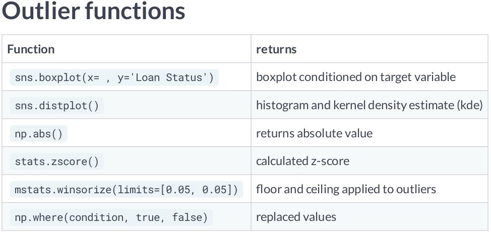
If your data contains many outliers, scaling using the mean and variance of the data is likely to not work very well. In these cases, you can use
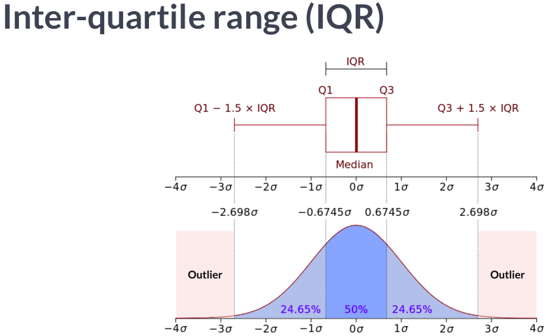
robust_scaleandRobustScaleras drop-in replacements instead. They use more robust estimates for the center and range of your data.RobustScalerremoves the median and scales the data according to the quantile range (defaults to IQR: Interquartile Range). The IQR is the range between the 1st quartile (25th quantile) and the 3rd quartile (75th quantile). Centering and scaling happen independently on each feature by computing the relevant statistics on the samples in the training set. Median and interquartile range are then stored to be used on later data using the transform method.
from sklearn.preprocessing import RobustScaler

X = [[ 1., -2.,  2.],
     [ -2.,  1.,  3.],
     [ 4.,  1., -2.]]

transformer = RobustScaler(with_centering=True, with_scaling=True, quantile_range=(25.0, 75.0)).fit(X)
print(transformer.transform(X))
Function to remove outliers
def CalcOutliers(df_num, limit = 3):

    # calculating mean and std of the array
    data_mean, data_std = np.mean(df_num), np.std(df_num)

    # seting the cut line to both higher and lower values
    # You can change this value
    cut = data_std * limit

    #Calculating the higher and lower cut values
    lower, upper = data_mean - cut, data_mean + cut

    # creating an array of lower, higher and total outlier values
    outliers_lower = [x for x in df_num if x < lower]
    outliers_higher = [x for x in df_num if x > upper]
    outliers_total = [x for x in df_num if x < lower or x > upper]

    # array without outlier values
    outliers_removed = [x for x in df_num if x > lower and x < upper]

    print('Total outlier observations: %d' % len(outliers_total)) # printing total number of values outliers of both sides
    print("Total percentage of Outliers: ", round((len(outliers_total) / len(outliers_removed) )*100, 4)) # Percentage of outliers in points
    print('Identified lowest outliers: %d' % len(outliers_lower)) # printing total number of values in lower cut of outliers
    print('Identified upper outliers: %d' % len(outliers_higher)) # printing total number of values in higher cut of outliers

    if len(outliers_higher) > 0:
        drp_upper = np.amin(np.array(outliers_higher), axis=0)
        print(f'Drop upper outliers >= {drp_upper}')

    if len(outliers_lower) > 0:
        drp_lower = np.amax(np.array(outliers_lower), axis=0)
        print(f'Drop lower outliers <= {drp_lower}')

    if len(outliers_lower) > 0 & len(outliers_higher) > 0:
        drp_lower = np.amax(np.array(outliers_lower), axis=0)
        drp_upper = np.amin(np.array(outliers_higher), axis=0)
        print(f'Drop outliers <= {drp_lower} and >= {drp_upper}')

    return
for i in df.columns:
    print(f'\nCalculating outliers for {i}...')
    CalcOutliers(df[i], limit = 3)
Non-linear transformations
- Two types of transformations are available: quantile transforms and power transforms. Both quantile and power transforms are based on monotonic transformations of the features and thus preserve the rank of the values along each feature.
- Quantile transforms the features to follow a uniform or a normal distribution. Therefore, for a given feature, this transformation tends to spread out the most frequent values. It also reduces the impact of (marginal) outliers: this is therefore a robust preprocessing scheme.
- Power transforms are a family of parametric transformations that aim to map data from any distribution to as close to a Gaussian distribution.
Normalization:
Normalize samples individually to unit norm.
Each sample (i.e. each row of the data matrix) with at least one non zero component is rescaled independently of other samples so that its norm
(l1 or l2)equals one.This transformer is able to work both with dense
numpyarrays andscipy.sparsematrix (useCSRformat if you want to avoid the burden of a copy / conversion).
from sklearn.preprocessing import Normalizer

X = [[4, 1, 2, 2],
     [1, 3, 9, 3],
     [5, 7, 5, 1]]

transformer = Normalizer(norm='l2').fit(X)
print(transformer.transform(X))
Box-Cox Transformations
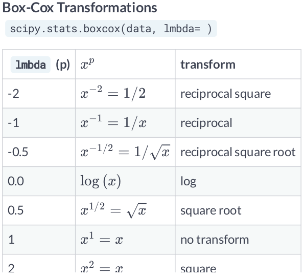
- When you are dealing with data, you are going to deal with features that are heavily skewed. Transformation techniques are useful to stabilize variance, make the data more normal distribution-like and improve the validity of measures of association.
- The problem with the Box-Cox Transformation is estimating lambda. This value will depend on the existing data, and should be considered when performing cross validation on out of sample datasets. Make sure to estimate lambda according to the training dataset.
- Other common transformation include
logandsquare roottransformation.
from sklearn.preprocessing import PowerTransformer
from sklearn.preprocessing import QuantileTransformer
from sklearn.model_selection import train_test_split

N_SAMPLES = 1000
FONT_SIZE = 14
BINS = 30

rng = np.random.RandomState(304)
bc = PowerTransformer(method='box-cox')
yj = PowerTransformer(method='yeo-johnson')
# n_quantiles is set to the training set size rather than the default value
# to avoid a warning being raised by this example
qt = QuantileTransformer(n_quantiles=500, output_distribution='normal',
                         random_state=rng)
size = (N_SAMPLES, 1)

# lognormal distribution
X_lognormal = rng.lognormal(size=size)

# chi-squared distribution
dfx = 3
X_chisq = rng.chisquare(df=dfx, size=size)

# weibull distribution
a = 50
X_weibull = rng.weibull(a=a, size=size)

# gaussian distribution
loc = 100
X_gaussian = rng.normal(loc=loc, size=size)

# uniform distribution
X_uniform = rng.uniform(low=0, high=1, size=size)

# bimodal distribution
loc_a, loc_b = 100, 105
X_a, X_b = rng.normal(loc=loc_a, size=size), rng.normal(loc=loc_b, size=size)
X_bimodal = np.concatenate([X_a, X_b], axis=0)

# create plots
distributions = [
    ('Lognormal', X_lognormal),
    ('Chi-squared', X_chisq),
    ('Weibull', X_weibull),
    ('Gaussian', X_gaussian),
    ('Uniform', X_uniform),
    ('Bimodal', X_bimodal)
]

colors = ['#D81B60', '#0188FF', '#FFC107',
          '#B7A2FF', '#000000', '#2EC5AC']

fig, axes = plt.subplots(nrows=8, ncols=3, figsize=(12, 18))
axes = axes.flatten()

axes_idxs = [(0, 3, 6, 9), (1, 4, 7, 10), (2, 5, 8, 11), (12, 15, 18, 21),
             (13, 16, 19, 22), (14, 17, 20, 23)]

axes_list = [(axes[i], axes[j], axes[k], axes[l])
             for (i, j, k, l) in axes_idxs]

for distribution, color, axes in zip(distributions, colors, axes_list):
    name, X = distribution
    X_train, X_test = train_test_split(X, test_size=.5)

    # perform power transforms and quantile transform
    X_trans_bc = bc.fit(X_train).transform(X_test)
    lmbda_bc = round(bc.lambdas_[0], 2)
    X_trans_yj = yj.fit(X_train).transform(X_test)
    lmbda_yj = round(yj.lambdas_[0], 2)
    X_trans_qt = qt.fit(X_train).transform(X_test)

    ax_original, ax_bc, ax_yj, ax_qt = axes

    ax_original.hist(X_train, color=color, bins=BINS)
    ax_original.set_title(name, fontsize=FONT_SIZE)
    ax_original.tick_params(axis='both', which='major', labelsize=FONT_SIZE)

    for ax, X_trans, meth_name, lmbda in zip(
            (ax_bc, ax_yj, ax_qt),
            (X_trans_bc, X_trans_yj, X_trans_qt),
            ('Box-Cox', 'Yeo-Johnson', 'Quantile transform'),
            (lmbda_bc, lmbda_yj, None)):
        ax.hist(X_trans, color=color, bins=BINS, )
        title = 'After {}'.format(meth_name)

        if lmbda is not None:
            title += r'\n$\lambda$ = {}'.format(lmbda)
        ax.set_title(title, fontsize=FONT_SIZE)
        ax.tick_params(axis='both', which='major', labelsize=FONT_SIZE)
        ax.set_xlim([-3.5, 3.5])

plt.tight_layout()
plt.show()
View Transformations with boxplot and theoretical quantiles
def plotting_3_chart(df, title = 'plot'):

    ## Creating a customized chart. and giving in figsize and everything.
    fig = plt.figure(constrained_layout=True, figsize=(8,5))
    ## creating a grid of 3 cols and 3 rows.
    grid = gridspec.GridSpec(ncols=3, nrows=3, figure=fig)

    ## Customizing the histogram grid.
    ax1 = fig.add_subplot(grid[0, :2])
    ## Set the title.
    ax1.set_title(f'{title} distribution')
    ## plot the histogram.f'{title}
    sns.distplot(df, norm_hist=True, ax = ax1, fit=stats.norm, bins=30)
    ax1.legend(('normal', f'{title}'))

    # customizing the QQ_plot.
    ax2 = fig.add_subplot(grid[1, :2])
    ## Set the title.
    ax2.set_title('QQ_plot')
    ## Plotting the QQ_Plot.
    stats.probplot(df, plot = ax2)

    ## Customizing the Box Plot.
    ax3 = fig.add_subplot(grid[:, 2])
    ## Set title.
    ax3.set_title('Box Plot')
    ## Plotting the box plot.
    sns.boxplot(df, orient='v', ax = ax3)

    plt.show();
import pylab
import matplotlib.gridspec as gridspec
sns.set(style="darkgrid", color_codes=True)

# Creat dummy arrays, skewed to the left
x = stats.loggamma.rvs(3, size=700) + 3

# How is the distribution for x?
plotting_3_chart(x, title = 'no transformation')

# What happens when log transformation?
plotting_3_chart(pd.Series(np.log(x)), title = 'log')

# What happens when sqrt transformation?
plotting_3_chart(pd.Series(np.sqrt(x)), title = 'sqrt')

# Now what happens when box-cox transformation?
x_bc, lmda = stats.boxcox(x)
plotting_3_chart(pd.Series(x_bc), title = 'box-cox')

print("lambda parameter for Box-Cox Transformation is {}".format(lmda))
View non transformed features vs features with outliers removed and boxcox transformation
from scipy.special import boxcox1p
from scipy.stats import boxcox_normmax
import warnings
warnings.filterwarnings('ignore')

boston = datasets.load_boston()
X, y = boston.data, boston.target
df = pd.DataFrame(data=boston.data, columns=boston.feature_names)

df_bc = df.copy()

# Normalize skewed features
for i in df_bc.columns:
    df_bc[i] = boxcox1p(df_bc[i], boxcox_normmax(df_bc[i] + 1))
# Remove outliers
transformer = RobustScaler(with_centering=True, with_scaling=True, quantile_range=(25.0, 75.0))
z1 = transformer.fit_transform(df_bc.values)
df_bc = pd.DataFrame(z1, columns=df_bc.columns)
rnk1 = Rank1D(algorithm='shapiro')
rnk1.fit(X, y)
rnk1.transform(X)
plt.close()

rnk1_df = pd.DataFrame(rnk1.ranks_, index=df.columns, columns=['Rank'])
rnk1_df = rnk1_df.sort_values('Rank', ascending=False)

X0 = df_bc

rnk10 = Rank1D(algorithm='shapiro')
rnk10.fit(X0, y)
rnk10.transform(X0)
plt.close()

rnk1_df0 = pd.DataFrame(rnk10.ranks_, index=df_bc.columns, columns=['Rank'])
rnk1_df0 = rnk1_df0.sort_values('Rank', ascending=False)

f, axes = plt.subplots(1,2 ,figsize=(12,5))
sns.barplot(x='Rank', y=rnk1_df.index, data=rnk1_df, ax=axes[0])
axes[0].set_title('Features')
axes[0].set_xlabel('Sharpio Rank')
axes[0].grid(False)

sns.barplot(x='Rank', y=rnk1_df0.index, data=rnk1_df0, ax=axes[1])
axes[1].set_title('BoxCox + RobustScaler Features')
axes[1].set_xlabel('Sharpio Rank')
axes[1].grid(False)

plt.tight_layout()
plt.show();
Discretization
- Discretization (otherwise known as quantization or binning) provides a way to partition continuous features into discrete values. Certain datasets with continuous features may benefit from discretization, because discretization can transform the dataset of continuous attributes to one with only nominal attributes. One-hot encoded discretized features can make a model more expressive, while maintaining interpretability.
KBinsDiscretizer discretizes features into k bins
X = np.array([[ -3., 5., 15 ],
              [  0., 6., 14 ],
              [ -1., 4., 18 ],
              [  6., 3., 11 ]])

est = preprocessing.KBinsDiscretizer(n_bins=[4, 3, 2], encode='ordinal').fit(X)
print(est.transform(X))
Feature binarization: Feature binarization is the process of thresholding numerical features to get boolean values. This can be useful for downstream probabilistic estimators that make assumption that the input data is distributed according to a multi-variate Bernoulli distribution.
X = [[ 1., -1.,  2.],
     [ 2.,  0.,  0.],
     [ 0.,  1., -1.]]

binarizer = preprocessing.Binarizer().fit(X)  # fit does nothing

print(binarizer.transform(X))
Generating polynomial features
- Often it’s useful to add complexity to the model by considering nonlinear features of the input data. A simple and common method to use is polynomial features, which can get features’ high-order and interaction terms.
Generate a new feature matrix consisting of all polynomial combinations of the features with degree less than or equal to the specified degree.
from sklearn.preprocessing import PolynomialFeatures

X = np.arange(20).reshape(5, 4)

print('Normal:')
print(pd.DataFrame(X))

poly = PolynomialFeatures(degree=2)

print('\nPoly:')
print(pd.DataFrame(poly.fit_transform(X)))